Logos of late
So I’ve racked up quite a few logos lately but I’ve failed to post them individually. So I decided to combine them into one post.


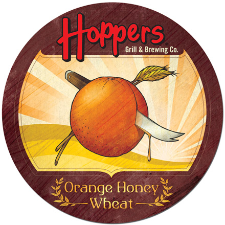
Hoppers coaster illustrations
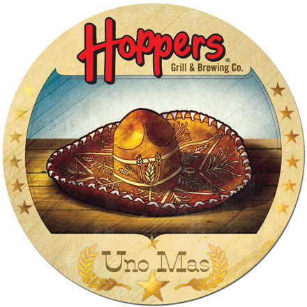
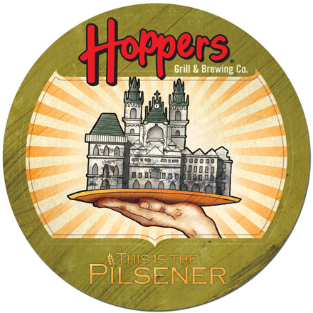
These are three of (someday nine) coaster illustrations I did for Hoppers. I had to take a flavor and come up with an illustration to accompany it. Orange Honey Wheat is pretty self explanatory, Uno Mas means “One More”. However, This is the Pilsener required some research. The flavor was created in a Bohemian town called Pilsen. The building on the platter is in the town square.
Hoppers Riders logo
So I was assigned with the task of taking the Hoppers logo and adding the word “Riders” to it to make something new. Aimed at the motorcycle enthusiasts, I was able to create a motorcycle shape out of the combination of the two words. It worked out perfectly and I am very happy with the result.
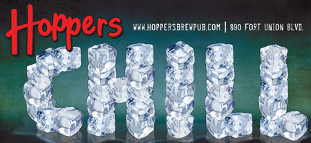
Hoppers Billboard and Door banner
Here are the two designs that made the final cut. I liked the runner up so much that I am posting it along with the actual chosen design. Hoppers is a really fun company to design for and I’ve got a few more finished projects to post, once they’ve been put into production.
The Chosen Design
The runner up
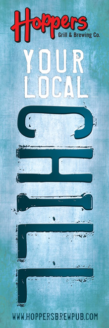
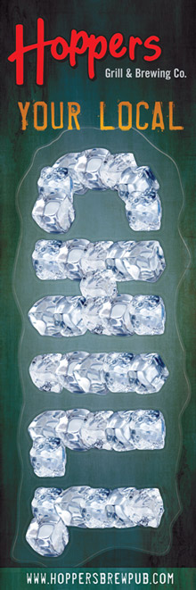
The coinciding Door Banners
Flash Banners
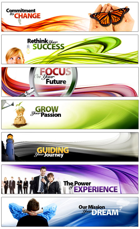
So I did this collection of flash banners for a corporate website. Below are the static images of the banners. To view the animations click here.. You will be taken to a page where you can stop and start each banner as you please. Each banner has some continuous motion after the initial animation plays out. They were a lot of fun to do (anything in flash is fun, really).
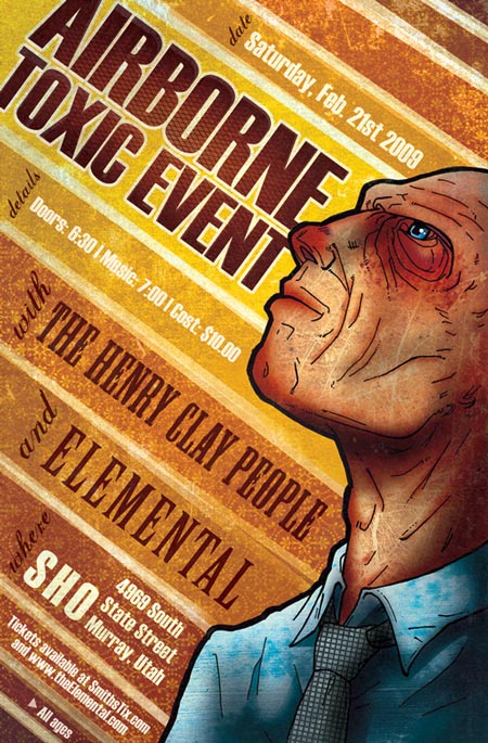
Airborne Toxic Event – concert poster
Another amazing opportunity to do what I truly love! I have yet to do anything I enjoy as much as concert posters. This one had a tight deadline but I was happy with the result. Originally I envisioned a whole row of people getting smaller the farther away they were but ran out of time, however confined to a single image made room for some interesting text placement. So, no complaints from me.
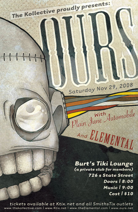
OURS concert poster
So the boys in the band Elemental are opening for OURS, one of my favorite bands. They asked me to create a poster for the event and I immediately agreed because, why wouldn’t I? It was a lot of fun and I am really pleased with the result.
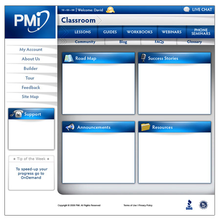
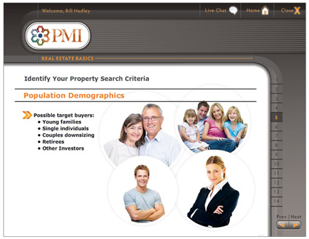
Interfaces
So these are two of the interfaces I did. The first is for the PMI Learning Management System. This is where clients go to manage there progress and get support and information. The second is the skin for the eLearning courses where said clients will watch and learn.
Adfortries
So I’ve been a little backed-up in my blog entries of late so these next few entries are going to be coming at you quick. First up is the Logo for the upcoming Web advertising site Adfortries.com.
An Artful Journey logo
This is a logo I did for a company that puts together art conferences and retreats. They really wanted to express the free spirit and “artsy” feel of what they do.
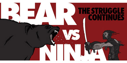
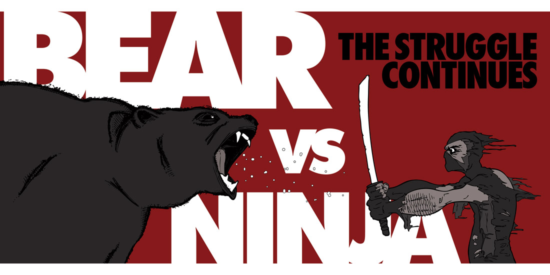
Bear vs. Ninja
Not enough attention has been brought to this subject. The war between bear and ninja has been around since the dawn of time. Countless lives have been lost. So much can be learned from these volatile creatures. If only we could find a way to end this rift.
For a larger view click here.
ELEMENTAL’s Down to the Wire album art
So we finally settled on an illustration for the album cover, and this is it.
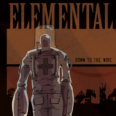
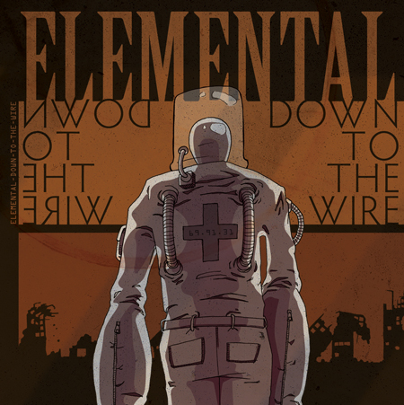
Elemental is also releasing a Down to the Wire preview disc with Limited edition artwork by me. Four different covers to choose from with four tracks from the upcoming album.
1)
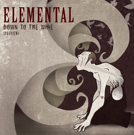
2)
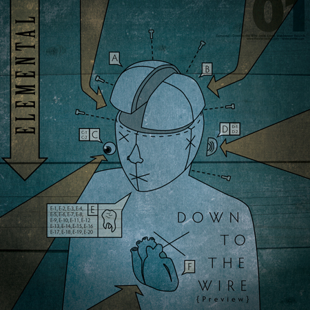
3)
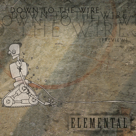
4)
