Another Collection of Logos
Here’s another collection of logos from the past few months.




Responsive Web Design
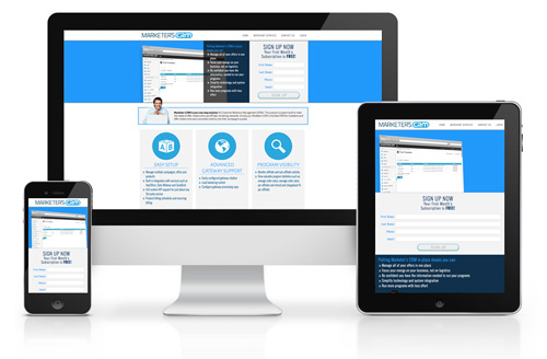
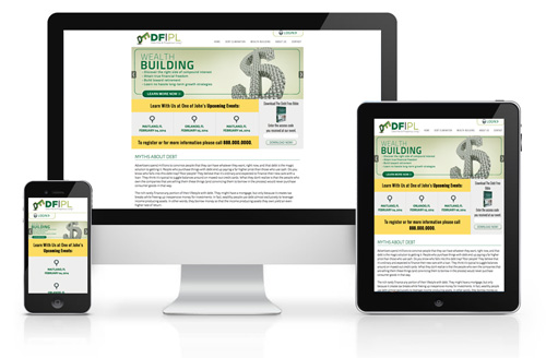
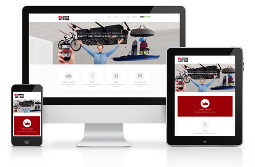
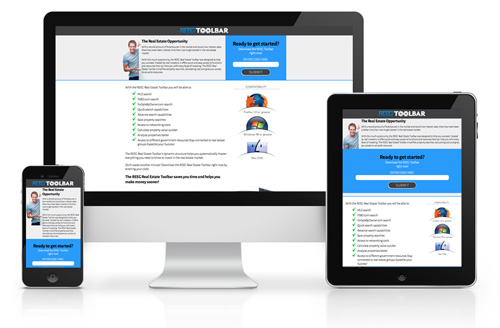
I’m not against using a builder or website template (I use them from time to time myself) but there’s something about knowing how to create something from scratch that really helps you to understand how it works. I’ve been doing a lot of these little corporate responsive sites lately. If you don’t know what a responsive site is, here’s a brief explanation. It’s a website that changes it’s formatting based on the device the user is viewing it with. If the user has a tablet then the format changes to fit that device. Same for a computer or smart phone. I won’t go into the boring details of it but it is fun to be able to decide a users viewing experience based on the device they are using. Here are some examples of what I’ve done in the last few months. These are all kind of in the same vein as they were mostly for the same type of client.

Octo-logo
I was commissioned to create an octopus-themed icon/logo for a motorcycle shop (just a coincidence that I just redid the jeffective logo with an octopus theme). While they decided not to use the motorcycle shaped octopus for their official icon they are having it put across the wall of the garage.

New jeffective Logo
I’ve had the same unaltered logo for about 8 years now and I’ve always felt that it wasn’t quite right. It didn’t exactly portray the qualities that I wanted jeffective to represent. So I finally decided to update it. I feel I’ve better achieved that here. Not only does it put the jeffective name together as it’s meant to be pronounced (jeffective not j-effective) but the tentacles represent the many facets of jeffective’s services. I’m excited to implement this new logo into the jeffective branding.

Logos of late
This is a collection of the logos that I’ve created over the last few months. I don’t get many chances to do a logo for something as fun as a horror blog so that one was particularly exciting to me.


Ikaika Group logo
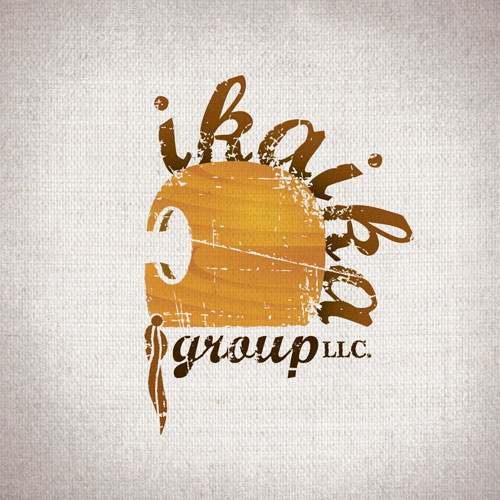
Ikaika means courage and so we modeled the logo after an ikaika warrior helmet. The words Ikaika making up the mohawk-like main of the helmet. I was very happy with how this turned out and I’m excited to add it to my portfolio.
Little Caesars animated menus
Little Caesars is changing their menus from printed panels to three 40″ flat screen televisions that digitally project the menus. They came to me and asked me to create an animated menu with dynamic capabilities. So I created a Flash file that can span all three TVs. The Flash file is controlled by an XML file that I scripted. They can open the XML file in NotePad and change all the prices of the items and turn the Hot-N-Ready flames and logos on or off. Recently they shared with me some of the feedback they got from a survey of 171 customers and it was almost through the roof positive (always great to hear). One other feature I created, but it turned out they didn’t need, was a script that checked the time of day and automatically turned on the right flames for the Hot-N-Ready pizzas. The reason they didn’t need it was that their IT department had already figured around that.
This is an image of the full menu

Because it’s so wide I’ve split it into three sections but the three pieces are supposed to interact with each other so it makes more sense when they are all in a line. The menu items slide from the side menus to the center when they are featured and when the Hot-N-Ready center slide comes up the flames in the side menus flare up to call attention to the pizzas that are Hot-N-Ready at that time.
Outback Flashlights: Defender Packaging
I’ve been working with Outback for over a year now but because of the sheer volume of work I’ve produced for them I haven’t posted anything. Some of it can be seen in the portfolio at my homepage jeffective.com but I want to try and post more of it here so that this doesn’t become just an outlet for my Illustration. Anyway, for each of their products I create a unique logo, Box Display, Ad Slick and Postcard. This Flashlight is a little unique in that it also has it’s own packaging. I was very pleased with how it all came out so I decided to start my Outback postings with it.

Logo round-up
I’ve done a lot of logos lately so I’ve decided to just do a quick post on a handful of the best ones. I’ve got other things to post but this has been on my to do list for a while. I’ve got a concert poster and line of product design for a new client. That’s all coming soon. For now, the logos:
This was a logo concept for a project that didn’t ever go anywhere but I liked how it turned out so I’m including it.
Website Makeovers
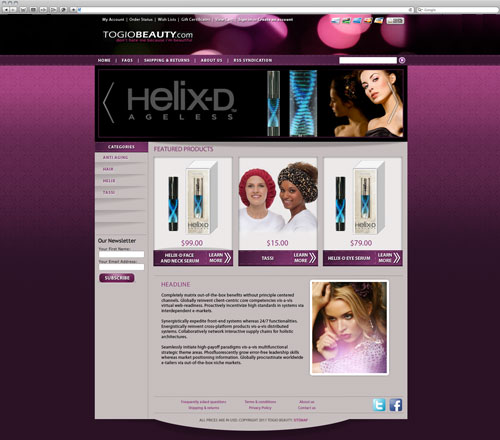
Lately I’ve been doing a lot of these. It’s fun to to take something that already exists and create my own take on the same information. It’s also really fun to build the sites. It’s nice to problem solve how to make things work within the confines of a website structure. Rather than just show the final product, I thought it would be cool to see how they looked before I started working on them.
Before:

After:

Before:

After:
Before:
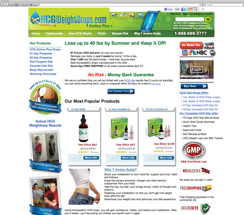
After:

Before:

After:

Before:

After:

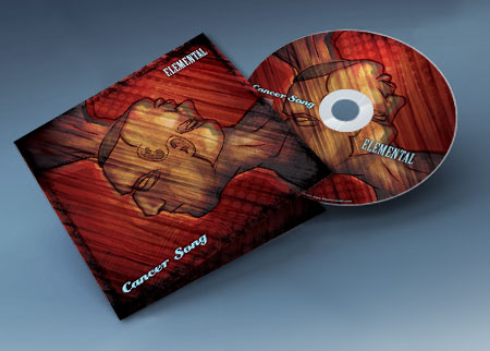
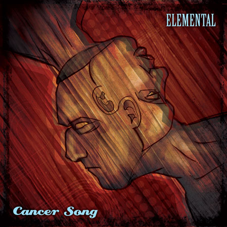
Cancer Song single artwork
This was actually a concept that I had created for Elemental’s upcoming 2nd album. We had moved past it long ago but I really liked it and felt it had it’s place somewhere else. When they told me they needed artwork for their first single “Cancer Song” I thought this worked perfectly.
Logo Roundup
This is a collection of logos that I’ve done in the past few months. Rather than post them one at a time I’ll probably just do a Logo roundup every couple of months. Enjoy.


