
Aug 1
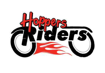
Hoppers Riders logo
Posted on Saturday, August 1, 2009 in Business Identity, Graphic Design, Logos
So I was assigned with the task of taking the Hoppers logo and adding the word “Riders” to it to make something new. Aimed at the motorcycle enthusiasts, I was able to create a motorcycle shape out of the combination of the two words. It worked out perfectly and I am very happy with the result.
Bring on the comments
Tuesday, August 4 8:44 pm
That kind of stuff stresses me out. You did a really good job though.
Tuesday, August 11 3:34 pm
weird name, sweet logo!
Friday, January 6 4:12 pm
nice name and awesome logo
Leave a Comment