Nov 11
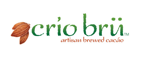
Crio Brü logo
Posted on Thursday, November 11, 2010 in Business Identity, Graphic Design, Logos
Hey, so I’m really excited about this project. This is the first piece of many and the starting point of any branding is the logo. This is a new product launch and I wanted to take this opportunity to show my process for creating a logo, from sketch to finished product.



I also created complimentary textures, colors and patterns to be used with this logo. The different colors will actually coincide with different flavors.

Next I’ll post the packaging design.
Bring on the comments
Thursday, November 11 8:59 pm
WHOOOOT!!! I can’t wait for this product to be released. Not only is it delicious and good for you, but you’ve made it so pretty. This is brewed CHOCOLATE, people. Not coffee, but chocolate. What you do: Get some. Because it’s delicious. And the packaging will tell you that it’s full of antioxidants and flavor and it will warm your hands while warming your heart. And while sipping your morning cup(s), you’ll read the beautiful and detailed label. And it will make you happy.
Thursday, November 11 9:46 pm
That’s really cool how you showed the process. As I looked at the earlier ones it wouldn’t seem quite right and it progressed down the page to something that I would see on the shelves and would look at because of the art. (I’ll admit to liking or buying things based on aesthetics)
Thursday, November 11 9:48 pm
Oh, and I really like the watermark back logo on the top of the textures part. It solidifies the logo as that brand and is something recognizable.
Friday, November 12 3:34 pm
since it looks so cool i will forgive you for using that font. 😉
i also liked how you showed your process. very cool design.
Friday, November 12 8:18 pm
Ha ha, Kass. That is NOT Papyrus. In the original meeting I had with them, Papyrus is what they wanted. I said absolutely NOT! I found my own font and made all those nicks and dents by hand. Which, in turn makes it more original and not very easily reproduced.
Wednesday, November 24 6:13 am
To be honest, when I first saw it I thought to myself, “Papyrus? Hmm.” But then when I saw your capitalization I realized my mistake, and then immediately liked the design about 40 times more.
And I love the subtle tweaks of color in the gradient over time. It helps me appreciate the effort that goes into making a logo work.
Thursday, April 28 7:26 pm
Absolutely LOVE IT!! Very interesting how it starts and progresses. I can’t wait to taste the it!
Great work, as always!
Leave a Comment